Write a Common CSS Style Library
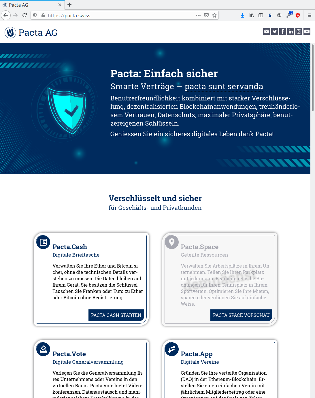
As a company that creates various products and services, mostly web applications and web based services, it is very important for Pacta Plc to have clear company identity with common look and feel in all our products and public appearances. Therefore our first step was to get official company corporate brand identity guidelines, a so called corporate identity CI. After having received our guidelines, the same designer was hired for creating a landing page. The result is what you now can see as our Pacta.Swiss corporate page. What the designer delivered, was only a sketch of the final result, which had to be implemented in HTML and CSS. Pacta styling follows best practices:
- Pure CSS3 + HTML5.
- No JavaScript for the basic layout. JavaScript is used in the basic design only to obfuscate the email address.
- Clear separation of styling and structure.
- All dimensions are relative to context (
%), font (rem,em,ex) or browser size (vh,vw). - No absolute dimensions (no
pxallowed). - Initial font size is not defined, so the user’s configuration is respected.
- No inline styling in HTML elements (no
style=). - Styles are attached to HTML by element name or class.
Basic technical decisions:
- Build environment is npm.
- CSS is generated using Stylus processor.
- Supported development environment is Linux only.
Initial Project Setup
We created an project pacta/style, that contains a file package.json and a folder for fonts, images, scripts and stylus.
package.json
The file package.json just holds the basics for CSS from Stylus:
- A script
npm installto install Stylus. - A script
npm run-script buildto build CSS. - A script
npm startto rebuild when a file changed .inotifywaitis a Linux tool to monitor file system changes.
{
  "name": "pacta-style",
  "version": "1.0.0",
  "dependencies": {
    "stylus": "^0.54.7"
  },
  "scripts": {
    "build-css": "stylus -c stylus/ --out css",
    "run-css": "while inotifywait -qq -e modify -r style/stylus; do npm run build-css; done",
    "build": "npm run build-css",
    "start": "npm run build-css && npm run run-css"
  }
}
All Stylus sources are in directory stylus and CSS targets are generated to directory css. This pacta/style project is included as git submodule in all other projects.
root.styl
To get a consistent look and to keep it easy to change basic settings, there are CSS variable definitions e.g. for the color palette, for basic spacing, for the border style or for the shadow definition.
:root
    --blue100 #002b5e
    --blue90 #013466
    --blue80 #034072
    --blue70 #034b7c
    --blue60 #045a89
    …
    --border 0.1em solid var(--blue100)
    --shadow 0 0.25rem 0.25rem 0 rgba(0, 0, 0, 0.14),
        0 0.5rem 0.1rem -0.25rem rgba(0, 0, 0, 0.12),
        0 0.1rem 0.75rem 0 rgba(0, 0, 0, 0.2)
    …
grid.styl
The styles define all objects in all resolutions based on element name or class, such as grids or cards:
.grid2, .grid3, .grid4
  --grid-size 1fr
  display grid
  grid-template-columns: repeat(var(--grid-columns), var(--grid-size))
  grid-auto-rows: min-content
.grid2
  --grid-columns 2
.grid3
  --grid-columns 3
.grid4
  --grid-columns 4
@media all and (max-width: 120rem)
    .grid4
        --grid-columns 2
@media all and (max-width: 80rem)
    .grid2
        --grid-columns 1
@media all and (max-width: 60rem)
    -grid4, .grid4
        --grid-columns 1
card.styl
.card
    display: grid
    grid-template-columns: auto 1fr
    border: var(--border)
    shadow: var(--shadow)
    width: calc(100% - 2em)
    .icon
        background-color: var(--blue100)
        width: 3rem
        height: 3rem
        border-radius: 50%
        svg, object, img
            width: calc( 100% - .2em )
            height: calc( 100% - .2em )
    > .heading
        background-color: var(--heading-bg)
        &, h1, h2, h3, h4, h5, h6
            color: var(--heading-color)
    .content
        display: flex
        flex-flow: column nowrap
        margin: .5em
        width: calc(100% - 1em)
The Landing Page
Our company landing page is Pacta.Swiss, where the company and its products are introduced. This is implemented as a static HTML page using the generated CSS. In fact, two pages, in English and German. The matching language is set from the browser through HTTP content negotiation by an Nginx server. This page’s implementation looks like:
  <body>
    <header>
      <div class="logo">
        <img src="style/images/logo.svg" alt="" /><span>Pacta AG</span>
      </div>
      <div>
        <nav class="social">
          <a>…</a>
          <a>…</a>
        </nav>
      </div>
    </header>
    <main>
      …
      <div class="container">
        <h2>…<span class="subtitle">…</span></h2>
        <div class="grid6">
          <div class="card">
            <div class="icon"><svg>…</svg></div>
            <div class="content">
              <h3>…<span class="subtitle">…</span></h3>
              <p>…</p>
              <div class="bottom"><a>…</a></div>
            </div>
          </div>
          <div class="card" disabled>
            <div class="icon"><svg>…</svg></div>
            <div class="content">
              <h3>…<span class="subtitle">…</span></h3>
              <p>…</p>
              <div class="bottom"><a>…</a></div>
            </div>
          </div>
          …
          </div>
        </div>
      </div>
      <div class="to-inverse" />
      <div class="inverse">
        <div class="container">
          <h2>…<span class="subtitle">…</span></h2>
          …
        </div>
        …
      </div>
    </main>
    <footer>…</footer>
  </body>
React Components
Our software consists of Progressive Web Applications written in ReactJS. So we need a react component library. For this, we simply created another git project pacta/components that only contains a large amount of JavaScript React Component files and is included as git submodule into all development projects. Based on the work above, it is very easy to implement React Components, just define the parameters and return the necessary HTML structure.
Grid.js
This is the full definition of our grid layout, where you can specify size as the maximum number of grid columns. The actually shown number of grid columns depends on the browser width, as defined in the CSS you see in the snipped above:
import React from 'react';
import PropTypes from 'prop-types';

export default class Grid extends React.PureComponent {
  static propTypes = {
    children: PropTypes.oneOfType([
      PropTypes.array,
      PropTypes.object,
      PropTypes.string
    ]),
    size: PropTypes.oneOfType([PropTypes.string, PropTypes.number]),
    type: PropTypes.string,
  };
  render = () => (
    <div
      className={
        'grid' +
        this.props.size +
        (this.props.type ? ' ' + this.props.type : '')
      }
    >
      {this.props.children}
    </div>
  );
}
Card.js
A card may have an icon and a heading:
import React from 'react';
import PropTypes from 'prop-types';
import MdiIcon from '@mdi/react';

export default class Card extends React.PureComponent {
  static propTypes = {
    children: PropTypes.oneOfType([
      PropTypes.array,
      PropTypes.object,
      PropTypes.string
    ]),
    type: PropTypes.string,
    icon: PropTypes.oneOfType([PropTypes.string, PropTypes.object]),
    heading: PropTypes.oneOfType([PropTypes.string, PropTypes.object])
  };
  heading = () =>
    typeof this.props.heading === 'string' ? (
      <h2>{this.props.heading}</h2>
    ) : (
      this.props.heading
    );
  render = () => (
    <div
      className={
        'card ' + (this.props.type || '') + (this.props.icon ? '' : ' noicon')
      }
    >
      {this.props.icon ? (
        <div
          className={'icon' + (this.props.type ? ' ' + this.props.type : '')}
        >
          {typeof this.props.icon === 'string' ? (
            <MdiIcon path={this.props.icon} />
          ) : (
            this.props.icon
          )}
        </div>
      ) : this.props.heading ? (
        <div className="heading">{this.heading()}</div>
      ) : (
        <></>
      )}
      {(this.props.children || (this.props.heading && this.props.icon)) && (
        <div className="content">
          {this.props.heading && this.props.icon ? this.heading() : <></>}
          {this.props.children}
        </div>
      )}
    </div>
  );
}
Usage Example
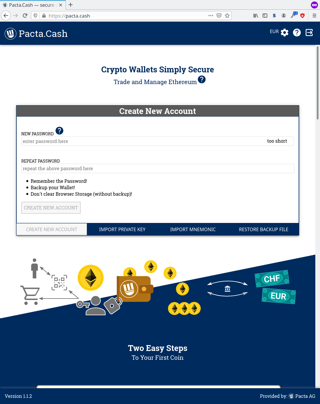
As a usage example for the above samples, here is a snippet from the landing page on Pacta.Cash:
class LandingPage extends React.Component {
  …
  render = () => (
    <>
      <StepsToCoin current={this.props.current} />
      <Container>
        <h2>
          {this.props.t("landingpage.titlewhy")}
          <span className='subtitle'>
            {this.props.t("landingpage.subtitlewhy")}
          </span>
        </h2>
        <Grid size='4'>
          <Card icon={this.FAQ}>
            {this.props.t("landingpage.wheretouse")}
            <p className='bottom'>
              <button disabled>{this.props.t("landingpage.more")}</button>
            </p>
          </Card>
          <Card icon={this.FAQ}>
            {this.props.t("landingpage.investment")}
            <p>
              <img src={ChartImage} alt='Ethereum chart of one year' />
            </p>
            <p className='bottom'>
              <button disabled>{this.props.t("landingpage.more")}</button>
            </p>
          </Card>
          <Card icon={this.FAQ}>
            {this.props.t("landingpage.privacy")}
            <p className='bottom'>
              <button disabled>{this.props.t("landingpage.more")}</button>
            </p>
          </Card>
          <Card icon={this.FAQ}>
            {this.props.t("landingpage.independence")}
            <p className='bottom'>
              <button disabled>{this.props.t("landingpage.more")}</button>
            </p>
          </Card>
        </Grid>
      </Container>
      …
  }
}
WordPress Template
Last but not least, our blog is written in WordPress, so Pacta also needs a WordPress template in the same style. Here we do the same, as with the React Component library, only that the template is now written in PHP instead of NodeJS.
wordpress.styl
There is only a very small additional Style file for WordPress specific definitions. All other definitions are comonnly shared:
html body #wpadminbar
    height: 46px
    width: 100%

.wp-type
    margin: 0 1em
    display: flex
    flex-flow: row nowrap
    justify-content: space-between
index.php
A WordPress template requires at least an index.php file, so let’s show this as an example:
<?php get_header() ?>

<?php if (have_posts()) : while (have_posts()) : the_post(); ?>

<?php if (has_post_thumbnail()) : ?>
<div class="cropped-image">
    <?php the_post_thumbnail('full') ?>
</div>
<?php endif ?>

<div class="wp-type">
    <div>
        <?php the_category(' ', ' → ') ?>
    </div>
    <div>
        <?php the_tags('', ' ', '') ?>
    </div>
</div>
</div>
<div class="container">
    <article>
        <h1><?php the_title() ?></h1>
        <?php the_content() ?>
    </article>
</div>

<?php endwhile; ?>
<?php endif; ?>
<?php get_footer() ?>
The Resulting Pages
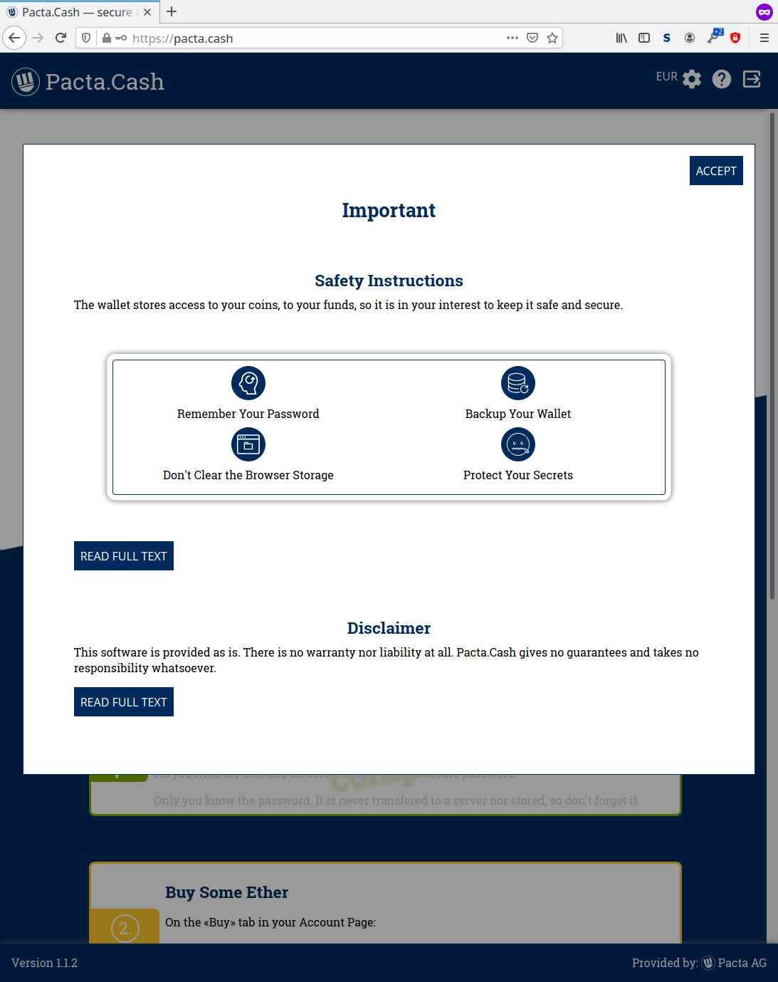
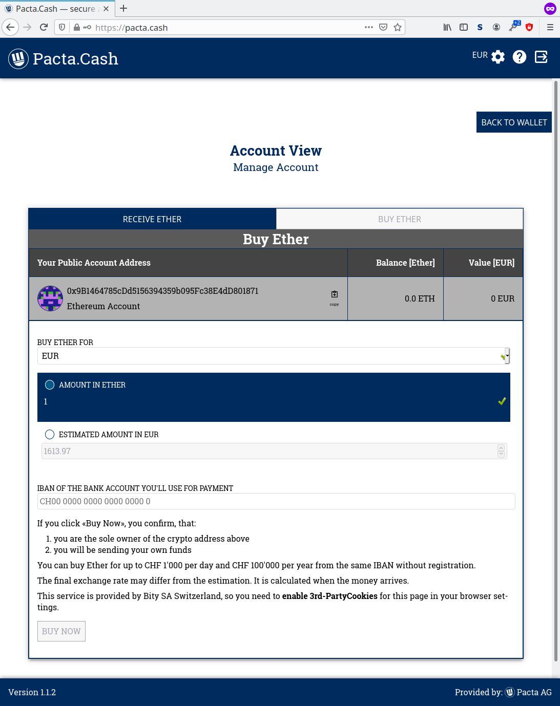
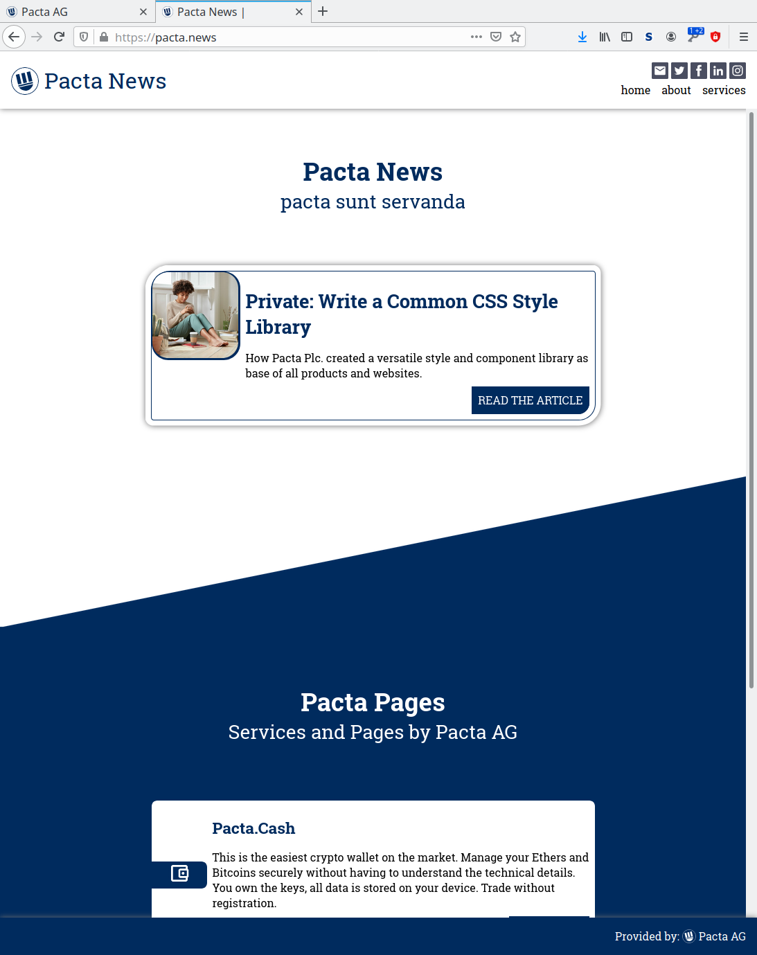
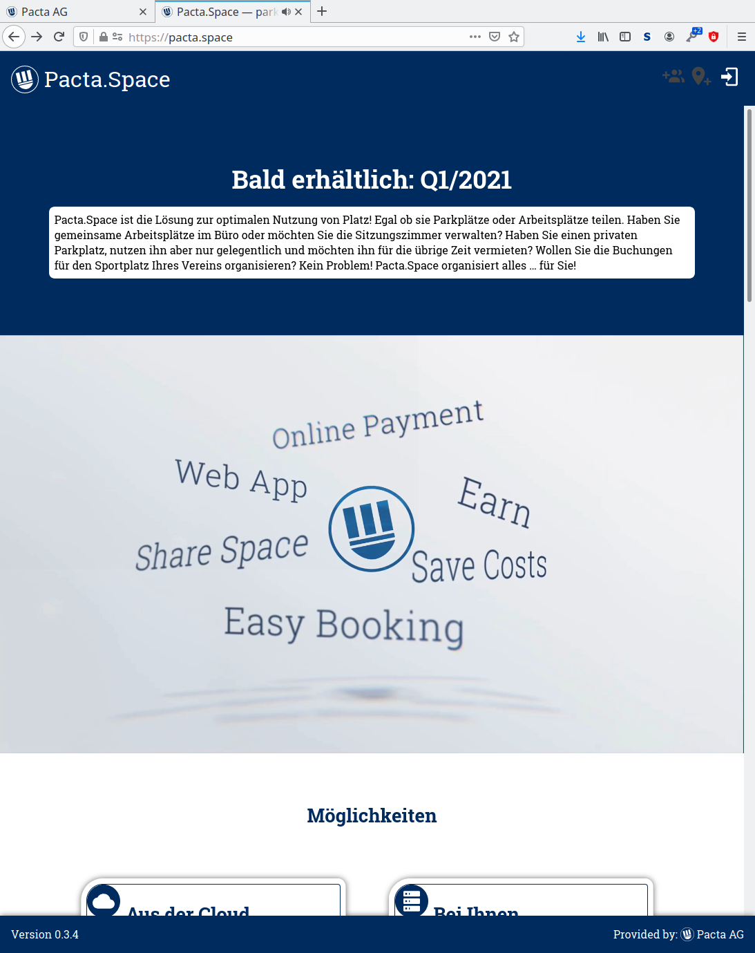
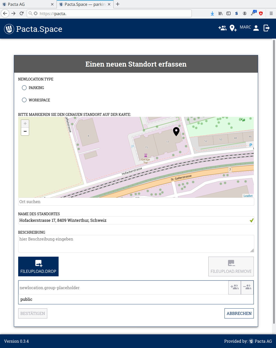
All this results in many different pages and applications, all sharing a common look and feel, and all are based on the exact same Stylus CSS files. Whenever we improve or change something in the styling, it will automatically be propagated to all our web pages and web services with their next update and release. So all the work has to be done only once, on the other hand, each change needs to be compatible to all usages.


